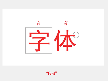
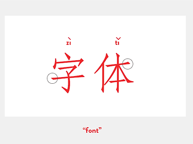
Examples of Chinese Typography 例子
This page showcases some images that were found and taken during this period of Guided learning.

01
Songti (宋体)
If one typeface had to be selected to symbolize Chinese typography, it would be the songti font. When Chinese woodblock printing was at its height during the Song Dynasty (960-1279 A.D.), early songti scripts were in use. Vertical lines, which ran against the wood grain, had to be thicker because they were more likely to break during carving than horizontal lines, which were made easier to make because the woodblocks' horizontal grain ran that way.
Additionally, flourishes were added to make the horizontal lines' end tips broader and more durable because they were easily worn away. Thus, the Chinese serif known as songti, which is characterized by flawlessly straight horizontal strokes, larger verticals, and elegant but methodical flourishes, was created.
02
Heiti (黑体)
The heiti, or "sans-serif" in a vague sense, is the other important classification for widely used Chinese fonts. Heiti typefaces were created quite recently. Although experts vigorously dispute its exact origins, we can observe the emergence of heiti in the commercial press around the turn of the 20th century.
Source Han Sans is a lovely heiti released by Adobe in 2014, in partnership with Google.

03
Kaiti (楷体)
The term "basic brush" could be translated roughly as "basic brush script lettering," which is what a kaiti typeface imitates. A kaiti, however, is not a novelty font—it never becomes excessively floral, is still built within predetermined limits, and retains an upright structure. It isone of the more clearly written ancient Chinese calligraphy script style, emerging somewhere between 151 - 239AD.
04
Fangsongti (仿宋体)
Fangsongti is a hybrid style that combines the hand-lettered appearance of a kaiti with the songti font's structural elements. The horizontal lines in a traditional songti are precisely straight, while those in a fangsongti are tilted, making it first difficult for the untrained eye to distinguish between the two. However, there is a quick way for doing so. The endpoint flourishes in the fangsongti also don't get as big, and the stroke widths don't fluctuate as much as they can in a songti.

05
Meishuti (美术体)
Meishuti is referred to as a "display font" in English. The word meishu simply means "artistic," therefore this includes a wide variety of lettering kinds. These are highly styled font faces that could be humorous, historical, or novelty. Meishuti typefaces are not web standards. You would need to use SVG or PNG techniques, or extremely experimental Asian font embedding formats like Youziku, to use these online.
06
Yuanti (圆体)
Yuanti are normally heiti's subclass (sans-serif). Yuan, which translates to "round" in Chinese, is more of a search term than a font type, and that's precisely what these sans-serif fonts with rounded edges are. Yuanti is frequently used in contemporary business materials and advertising. Additionally, there are no web-safe typefaces present.

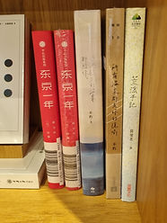
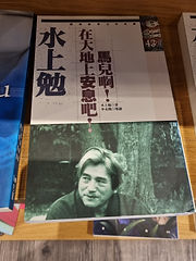


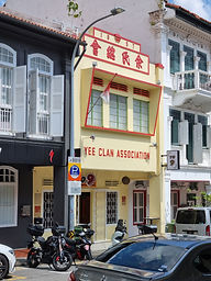


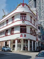


Photos were taken by: Wan Ni
Some places are taken at Outram Park and Greenroots bookstore